
Alpine.js Full Tutorial: The Lightweight JavaScript Framework

Introduction to Alpine.js
Alpine.js is a rugged, minimal framework for composing JavaScript behavior in your markup. It offers the reactive and declarative nature of big frameworks like Vue or React at a much lower cost (only ~7kB gzipped).
Why Choose Alpine.js?
- Lightweight: Only 7kB minified & gzipped
- No build step: Works directly in the browser
- Simple syntax: Easy to learn if you know HTML
- Reactive data: Automatically updates the DOM when data changes
- No virtual DOM: Direct DOM manipulation
- Perfect for: Enhancing server-rendered pages, small to medium apps
Getting Started
Installation
You can include Alpine.js in your project in several ways:
- Via CDN (simplest for quick projects):
<script defer src="https://cdn.jsdelivr.net/npm/alpinejs@3.x.x/dist/cdn.min.js"></script>
- Via NPM (better for larger projects):
npm install alpinejs
Then in your JavaScript:
import Alpine from 'alpinejs'
window.Alpine = Alpine
Alpine.start()
- Using Vite/Webpack (modern build tools):
import Alpine from 'alpinejs'
import focus from '@alpinejs/focus' // Optional plugins

Alpine.plugin(focus)
window.Alpine = Alpine
Alpine.start()
Core Concepts
1. x-data
The foundation of Alpine is x-data, which declares a new component scope.
<div x-data="{ count: 0 }">
    <button @click="count++">Increment</button>
    <span x-text="count"></span>
</div>
2. x-show / x-if
Conditionally show elements:
<div x-data="{ open: false }">
    <button @click="open = !open">Toggle</button>

    <div x-show="open" x-transition>
        Content that shows/hides
    </div>

    <template x-if="open">
        <div>Content that is removed from DOM</div>
    </template>
</div>
3. x-bind (:)
Dynamically set HTML attributes:
<div x-data="{ isActive: true }">
    <span :class="{ 'text-red-500': isActive }">Colored Text</span>
    <button :disabled="isActive">Button</button>
</div>
4. x-on (@)
Listen for browser events:
<div x-data="{ count: 0 }">
    <button @click="count++">+</button>
    <button @click="count--">-</button>
    <span x-text="count"></span>

    <input @keyup.enter="alert('Enter pressed!')">
</div>
5. x-model
Two-way data binding for form inputs:
<div x-data="{ message: '' }">
    <input x-model="message" placeholder="Type something">
    <p>You typed: <span x-text="message"></span></p>
</div>
6. x-text / x-html
Update text or HTML content:
<div x-data="{ title: 'Hello', content: '<strong>Alpine.js</strong>' }">
    <h1 x-text="title"></h1>
    <div x-html="content"></div>
</div>
7. x-for
Render lists:
<div x-data="{ items: ['Apple', 'Banana', 'Orange'] }">
    <template x-for="item in items" :key="item">
        <li x-text="item"></li>
    </template>
</div>
8. x-init
Run code when a component initializes:
<div x-data="{ count: 0 }" x-init="count = 5">
    <span x-text="count"></span> <!-- Outputs 5 -->
</div>
Practical Examples
1. Simple Counter
<div x-data="{ count: 0 }">
    <button @click="count--">Decrement</button>
    <span x-text="count"></span>
    <button @click="count++">Increment</button>
</div>
2. Todo List
<div x-data="{
    todos: [],
    newTodo: '',
    addTodo() {
        if (!this.newTodo.trim()) return;
        this.todos.push({
            id: Date.now(),
            text: this.newTodo,
            completed: false
        });
        this.newTodo = '';
    },
    removeTodo(id) {
        this.todos = this.todos.filter(todo => todo.id !== id);
    },
    toggleTodo(id) {
        const todo = this.todos.find(todo => todo.id === id);
        todo.completed = !todo.completed;
    }
}">
    <input
        x-model="newTodo"
        @keyup.enter="addTodo()"
        placeholder="Add a todo"
    >
    <button @click="addTodo()">Add</button>

    <template x-for="todo in todos" :key="todo.id">
        <div>
            <input
                type="checkbox"
                @change="toggleTodo(todo.id)"
                :checked="todo.completed"
            >
            <span
                x-text="todo.text"
                :class="{ 'line-through': todo.completed }"
            ></span>
            <button @click="removeTodo(todo.id)">×</button>
        </div>
    </template>
</div>
3. Modal Component
<div x-data="{ open: false }">
    <button @click="open = true">Open Modal</button>

    <div
        x-show="open"
        @click.away="open = false"
        x-transition
        style="display: none"
    >
        <div>
            <h2>Modal Title</h2>
            <p>Modal content goes here...</p>
            <button @click="open = false">Close</button>
        </div>
    </div>
</div>
4. Tabs Component
<div x-data="{ activeTab: 'tab1' }">
    <div>
        <button @click="activeTab = 'tab1'">Tab 1</button>
        <button @click="activeTab = 'tab2'">Tab 2</button>
        <button @click="activeTab = 'tab3'">Tab 3</button>
    </div>

    <div>
        <div x-show="activeTab === 'tab1'">Tab 1 Content</div>
        <div x-show="activeTab === 'tab2'">Tab 2 Content</div>
        <div x-show="activeTab === 'tab3'">Tab 3 Content</div>
    </div>
</div>
5. Fetch API Data
<div x-data="{
    posts: [],
    loading: false,
    error: null,
    async fetchPosts() {
        this.loading = true;
        this.error = null;
        try {
            const response = await fetch('https://jsonplaceholder.typicode.com/posts');
            this.posts = await response.json();
        } catch (err) {
            this.error = 'Failed to fetch posts';
        } finally {
            this.loading = false;
        }
    }
}" x-init="fetchPosts()">
    <template x-if="loading">
        <p>Loading...</p>
    </template>

    <template x-if="error">
        <p x-text="error" class="text-red-500"></p>
    </template>

    <template x-for="post in posts" :key="post.id">
        <div>
            <h3 x-text="post.title"></h3>
            <p x-text="post.body"></p>
        </div>
    </template>
</div>
Advanced Features
1. Reusable Components with x-data
You can create reusable components by extracting the JavaScript object:
<script>
document.addEventListener('alpine:init', () => {
    Alpine.data('counter', () => ({
        count: 0,
        increment() { this.count++ },
        decrement() { this.count-- }
    }))
})
</script>

<div x-data="counter">
    <button @click="decrement()">-</button>
    <span x-text="count"></span>
    <button @click="increment()">+</button>
</div>
2. Using Stores for Global State
<script>
document.addEventListener('alpine:init', () => {
    Alpine.store('cart', {
        items: [],

        add(item) {
            this.items.push(item)
        },

        remove(id) {
            this.items = this.items.filter(item => item.id !== id)
        },

        get total() {
            return this.items.reduce((sum, item) => sum + item.price, 0)
        }
    })
})
</script>

<!-- Component 1 -->
<div x-data>
    <button @click="$store.cart.add({ id: 1, name: 'Product', price: 10 })">
        Add to Cart
    </button>
</div>

<!-- Component 2 -->
<div x-data>
    <div x-text="$store.cart.items.length"></div>
    <div x-text="'$' + $store.cart.total"></div>
</div>
3. Custom Directives
You can extend Alpine with custom directives:
<script>
document.addEventListener('alpine:init', () => {
    Alpine.directive('uppercase', (el) => {
        el.textContent = el.textContent.toUpperCase()
    })
})
</script>

<div x-data>
    <p x-uppercase>This text will be uppercase</p>
</div>
4. Magic Properties
Alpine provides several magic properties:
$el- The current element$refs- Access to elements marked withx-ref$watch- Watch for changes in data$dispatch- Dispatch custom events
Example using $watch:
<div x-data="{ count: 0 }" x-init="$watch('count', value => console.log(value))">
    <button @click="count++">Increment</button>
</div>
5. Transition System
Alpine has a built-in transition system:
<div x-data="{ open: false }">
    <button @click="open = !open">Toggle</button>

    <div x-show="open" x-transition>
        Default transition
    </div>

    <div x-show="open" x-transition:enter="transition ease-out duration-300"
                          x-transition:enter-start="opacity-0 transform scale-90"
                          x-transition:enter-end="opacity-100 transform scale-100"
                          x-transition:leave="transition ease-in duration-300"
                          x-transition:leave-start="opacity-100 transform scale-100"
                          x-transition:leave-end="opacity-0 transform scale-90">
        Custom transition
    </div>
</div>
Alpine.js Plugins
Alpine can be extended with official and community plugins:
1. @alpinejs/focus
npm install @alpinejs/focus
import focus from '@alpinejs/focus'
Alpine.plugin(focus)
Now you can use x-focus:
<div x-data="{ open: false }">
    <button @click="open = true">Open</button>

    <div x-show="open">
        <input type="text" x-focus>
    </div>
</div>
2. @alpinejs/mask
For input masking:
npm install @alpinejs/mask
import mask from '@alpinejs/mask'
Alpine.plugin(mask)
Usage:
<input x-data x-mask="(999) 999-9999" placeholder="(123) 456-7890">
3. @alpinejs/collapse
For collapsible content:
npm install @alpinejs/collapse
import collapse from '@alpinejs/collapse'
Alpine.plugin(collapse)
Usage:
<div x-data="{ open: false }">
    <button @click="open = !open">Toggle</button>

    <div x-show="open" x-collapse>
        Long content that will be collapsed/expanded
    </div>
</div>
Performance Tips
- Limit reactivity: Only make data reactive when necessary
- Use
x-initwisely: Avoid heavy operations in initialization - Debounce events: For events that fire frequently (like
@input) - Avoid deep nesting: Deeply nested reactive objects can be slow
- Use
x-cloak: To hide elements until Alpine is initialized
<style>
[x-cloak] { display: none !important; }
</style>

<div x-data x-cloak>
    Content hidden until Alpine loads
</div>
Alpine.js vs Other Frameworks
| Feature | Alpine.js | Vue | React |
|---|---|---|---|
| Size | ~7kB | ~30kB | ~40kB |
| Virtual DOM | No | Yes | Yes |
| Build Step | Optional | Required | Required |
| Learning Curve | Easy | Medium | Medium |
| Best For | Enhancements | SPAs | SPAs |
| Reactivity | Automatic | Automatic | Manual (useState) |
Common Pitfalls
- Forgetting
x-data: All Alpine code must be inside anx-datascope - Direct DOM manipulation: Avoid mixing Alpine with direct DOM manipulation
- Overusing reactivity: Not everything needs to be reactive
- Memory leaks: Clean up event listeners in
x-initif needed - Race conditions: Be careful with async operations and state changes
Testing Alpine Components
While Alpine doesn't have an official testing framework, you can test components with:
- Jest + jsdom: For unit testing
- Cypress: For end-to-end testing
- Testing Library: For DOM testing utilities
Example Jest test:
test('counter increments', () => {
    document.body.innerHTML = `
        <div x-data="{ count: 0 }">
            <button @click="count++"></button>
            <span x-text="count"></span>
        </div>
    `;

    Alpine.start();
    const button = document.querySelector('button');
    const span = document.querySelector('span');

    button.click();
    expect(span.textContent).toBe('1');
});
Alpine.js Ecosystem
- Official Plugins: Focus, Mask, Collapse, etc.
- Community Plugins: Persist, Intersect, etc.
- DevTools: Alpine.js DevTools extension for Chrome
- UI Libraries: Alpine components libraries
- Integrations: With Laravel, WordPress, etc.
Real-World Example: Product Filter
<div x-data="{
    products: [
        { id: 1, name: 'Laptop', category: 'electronics', price: 999 },
        { id: 2, name: 'Smartphone', category: 'electronics', price: 699 },
        { id: 3, name: 'T-shirt', category: 'clothing', price: 19 },
        { id: 4, name: 'Jeans', category: 'clothing', price: 49 }
    ],
    filters: {
        category: '',
        maxPrice: 1000
    },
    get filteredProducts() {
        return this.products.filter(product => {
            return (
                (this.filters.category === '' ||
                 product.category === this.filters.category) &&
                product.price <= this.filters.maxPrice
            )
        })
    }
}">
    <div>
        <select x-model="filters.category">
            <option value="">All Categories</option>
            <option value="electronics">Electronics</option>
            <option value="clothing">Clothing</option>
        </select>

        <input
            type="range"
            x-model="filters.maxPrice"
            min="0"
            max="1000"
        >
        <span x-text="'Max Price: $' + filters.maxPrice"></span>
    </div>

    <div>
        <template x-for="product in filteredProducts" :key="product.id">
            <div>
                <h3 x-text="product.name"></h3>
                <p x-text="'Category: ' + product.category"></p>
                <p x-text="'Price: $' + product.price"></p>
            </div>
        </template>
    </div>
</div>
Conclusion
Alpine.js is a powerful yet simple framework that brings reactivity to your markup without the overhead of larger frameworks. It's perfect for:
- Adding interactivity to server-rendered pages
- Building small to medium applications
- Quickly prototyping ideas
- Enhancing traditional websites
With its declarative syntax, small footprint, and easy learning curve, Alpine.js is an excellent choice for developers who want reactivity without complexity.
Happy coding with Alpine.js!
Projects to explore next
Source-code projects from the KritiMyantra catalogue. Check each project's details before buying.
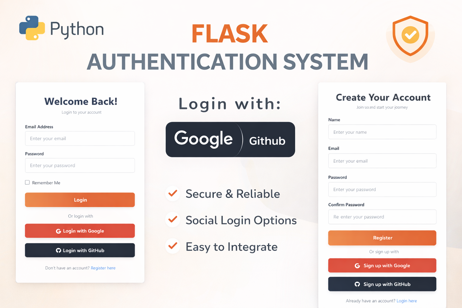
Flask Authentication System (Free Version) - Kritim Yantra
🛠 Features✔ Google & GitHub Authentication✔ User Registration & Login✔ Profile/Dashboard Access✔ Secure & Mi...

Flask Blog CMS with Admin Dashboard — Python Source Code
A Flask-based blogging website with a built-in admin dashboard. Manage articles, images, categories, tags and featured p...
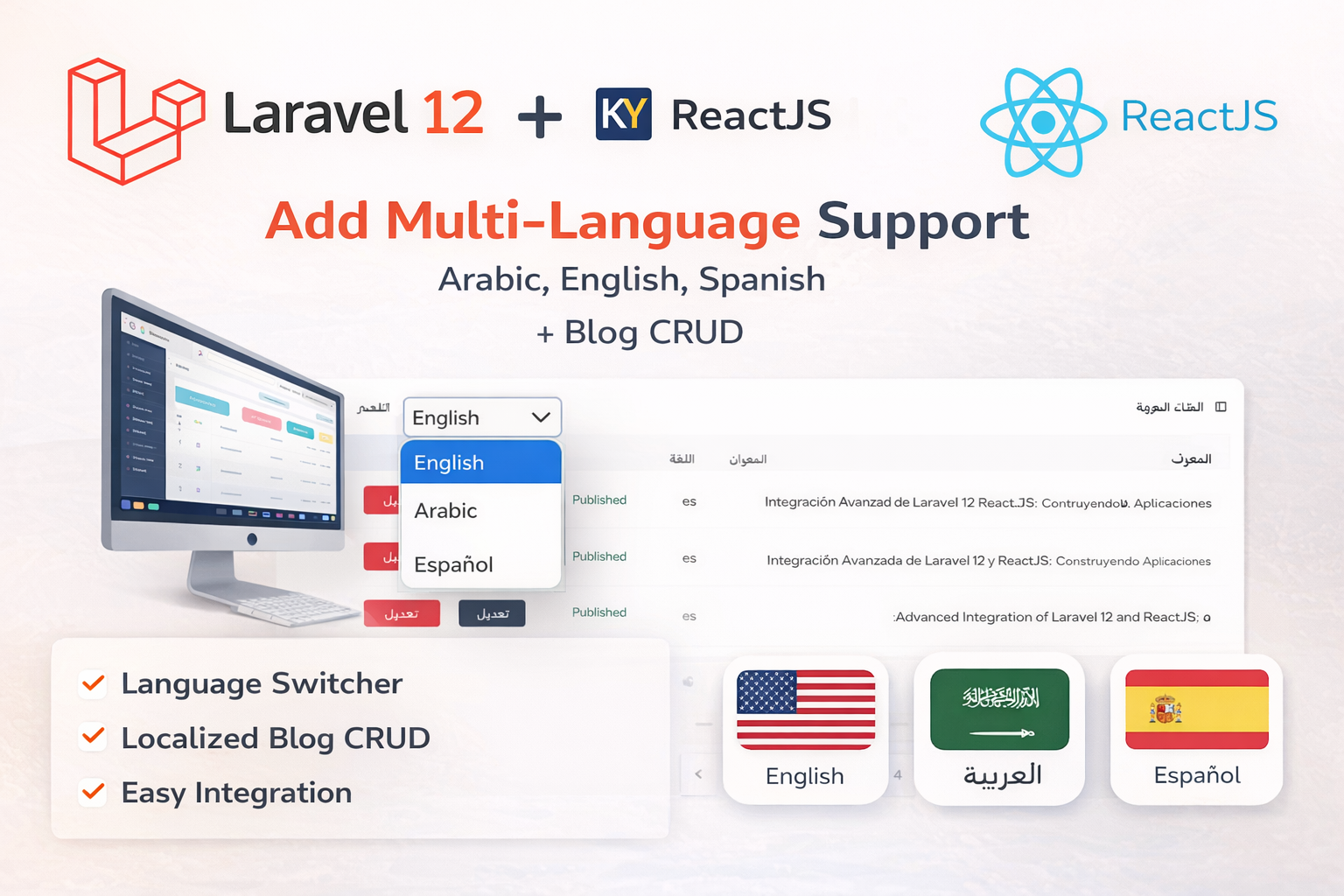
Laravel 12 + ReactJS Starter Kit: Add Multi-Language Support (Arabic, English, Spanish) with Blog CRUD
🚀 Installation & Setup Download & Extract Get the ZIP from kritimyantra.com and extract it. Includes preconfigu...
Understanding PHP 8.4: A Beginner's Guide with Real-World Applications
PHP is one of the most popular server-side scripting languages, widely used for web development. Its simplicity and ease of use ma...
What Topics in PHP Should You Learn Before Learning Laravel?
Laravel is a powerful PHP framework that simplifies web development by providing elegant syntax and a rich set of tools. However,...
Laravel 12 CRUD API with Error Handling
In this blog, we'll walk through creating a simple CRUD (Create, Read, Update, Delete) API using Laravel 12. We'll also implement...
Comments
No comments yet. Be the first to comment.
Sign in to join the discussion.